Wednesday, 12 March 2008

'Natural Language' Mood Board #1


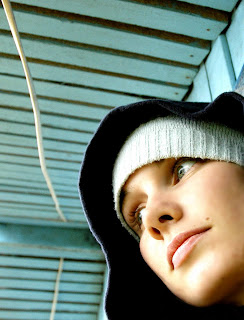
Here is my first interpretation of 'Natural Language' in purely pictorial form, a typographic impression will follow shortly.

Tuesday, 11 March 2008

Raw Creation

I feel that this week I’ve been plunged into an uncomfortable journey of self discovery rather then beginning a new unit on a HND! The crux of this has of course been the bizarre CD which Steve imparted to me last week. A CD which I have to say is not for the faint hearted or us sensitive folk of Norfolk. Now I may speak the truth, and have no intention of marketing the CD to you, I will disclose that it is really rather disturbing. In fact, so much so, I found myself wincing as it echoed out of the speakers, almost tainting the haven which once was my bedroom! Upon reflection I concluded that for mere sound to provoke such a reaction it must be pretty powerful stuff and therefore would fuel immense creation. This creation, if anything, would provide an attempt to de-construct the complex relationship between sound and vision and emotion.

I can already sense the challenge of this unit will be to combine raw creativity into functional design without losing the soul of the idea, or inspiration. This has become apparent to me as in a parallel universe I flooded my visions with corporate, cold, clinical logos so highly worked and finished they appeared to be mechanically produced, void of all human input.

In keeping with this idea I have been careful not to impose any preconceived ideas for a finished product in relation to the CD I have been given. I intend to be as loose and open to outside and inside sources as much as possible to avoid suffocating originality. I’m also going to attempt to keep a distant perspective of other people’s ideas in order to avoid fixation with their own creations or early perceptions of mine. This of course may present difficulties in terms of feedback but initially I feel it is important to remain objective to ensure maximum creative output and experimentation is undertaken.

In conclusion I am delighted with the concepts we are exploring in this new unit and I feel extremely excited at the prospect of what it will produce. During the week visuals will be posted to reflect my progression of thought.

Monday, 10 March 2008

CD Review- Natural Language

Natural Language leads you on a unique, complex journey into the depths of your very conscious. It’s powerful , intense rhythms overwhelm your mind probing and challenging your inner most being. The abrasive rawness of each track resonates through your soul unearthing a myriad of suppressed emotions. It’s deep movements are so thick and encompassing yet paradoxically ethereal in their provoked reflections.

Untouchable and often uncomfortable Natural Language presents a rare and unprecedented plunge into the unknown, the only question is will you like what you find?

Tuesday, 4 March 2008

A6 Evaluation

I have to say A6 Revert to Type has turned out very differently to what I anticipated. Naively, at the start of the project, I imaged to breeze through the unit and was astounded at, seemingly, how little we had to do. How wrong could I be! A6 has been an extremely enjoyable but challenging unit, pushing my design skills and stamina to their limits. I will now reflect on my performance across each task and evaluate how successfully I met each brief.

Hokai
Leading up to ‘Hokai’ we had fortunately had a test run at timed task [The Font Book]. This helped immensely with two important factors; attention to detail and time management. This was particularly crucial as I was completing the task remotely. My initially impressions of the task were that it was significantly more complicated than before, so the margin for error would be higher. To overcome this issue I thoroughly read and re-read the brief before starting. Once a time plan was in place I wasted no time sketching a multitude of designs, my focus was to create an easily recognisable label that had a relevant identity to the brand. Unfortunately, due to the small size of the design and the amount of information we needed to include this was a challenge. The final design which I decided to develop incorporated a circular filled area in the center of the label, this both acted as an indicator for the colour of the paint and provided a link to it’s oriental identity [mimicking the design of the Japanese flag]. When transferring the design into InDesign my first priority was to ensure the information was inputted correctly. The second priority was to select a suitable typeface for the brand name of the paint. Time restrictions made this difficult to accomplish to the standard I sort to achieve, therefore I am not completely happy with the featured typeface. However, I believe the design decisions I made within the tight time limit was satisfactory. Overall I am pleased with the outcome of the final design, it fulfils the criteria of the brief and incorporates an oriental theme, which I set out to achieve.

Vodafone
The Vodafone task was focused more around being creative with the layout of the design. This was due the design decisions which had to be made in relation to the basic size within which the design would fit, with every size equating to a different cost. Thankfully the detailed explanation of the task by Steve enabled me to approach the task with confidence. As always it was important to throughly understand the constraints of the task, otherwise all design work would be flawed. My personal focus for this task was to create design features that would give the ad immediate impact. I also wanted the ad to have direct appeal to the individual by putting emphasis on the 'You' and 'Your' in the body text, unfortunately this idea disrupted the rhythm of the design so it was abandoned. However, I feel I did successfully achieved impact in the design but using the Vodafone trademark symbol repeated as speech marks to enclose the body text.

Morris Fuller Benton Presentation - Slide Designs
The slide designs I created for my typographer presentation are overall my most successful work within A6. I feel that I have managed to achieve a consistent, flowing and original presentation, which is both informative and visually interesting. This was achieved through extensive research which fueled experimentation and great enthusiasm for the subject matter.
Morris Fuller Benton Presentation - Delivery
The section of A6 I am most displeased with was the delivery of my presentation. Restrictions on the amount of time I could dedicate to work had the greatest impact on this section. This meant that I had not adequately practiced my delivery and I also did not also myself sufficient time, before the presentation, to collect my thoughts and composition. this was reflected in my lack of focus during the delivery of each slide and a observable lack of commitment to what I was saying. The presentation was not strong or convincing and overall I was extremely frustrated and disappointed with my performance.

Timed Exam - Grid & Story
The last section of work for A6 was the one I held least enthusiasm for. This was mainly due to the circumstances under which I task had to be performed and the fatigue I felt at the time. I was mentally and physically unable to give anything, so I held out little hope for the quality of my work I would produce. However, the designs seemed to flow effortlessly as the task commenced and I was pleasingly surprised at what I had achieved at the end of section one, the completing of the grid system. Thankfully this continued into section two. My aim for the design was to create a contemporary piece which still reflected the 'Jazz' genre. I settled on a bold reverse, masthead, justified right and with a high contrast between the two featured typefaces. I chose the Eras type family for all of the text within the design, this allowed flexibility but also kept consistency. My focus for the main body of text was to keep simplicity and also allow good readability. I chose to repeat the boldness of the headline further down in the text with a pull quote, not only to add interest to the information but also to add harmony to the design. The intention of the piece was to creating a snaking flow down the page between emboldened elements. I also chose to deliberately break the rule of facing the image across the page, this was intended to compliment the originality of the piece and also repeat the weighting of the masthead.

Summary
Overall I am extremely pleased with the body of work i have produced for A6. I feel it reflects a consistent application of skills and knowledge and a growing awareness of aesthetic nuances. Greater organisation and more refined time management may have further assisted achievement in this unit. However, distinct determination and enthusiasm for the subject played an important role in progression of work in this unit.

Tuesday, 26 February 2008

How to Suck a Lemon


The end is insight yet with it comes the bittersweet experience of relief tainted with overtones of anxiety and stress! Although I feel my website is pretty much complete the more I test the more I want to tweek and the longer my to-do list becomes! Looking back I have to say I feel I’ve come a long way since my first decidedly dodgy page designs. It has been a rather queer experience into the unknown, rather bitter at times but now fairly refreshing. I’m sure I will look back with a wry grin at what will seem a very amateurish website but right now I’m quite proud of how it’s turned out. The rest of this week will be dedicated to collating my useabilty testing to form an evaluation based on the project goals. Equally I’m sure the feedback form will require much tweeking as I have been still unable to upload the now version due to Internet connection problems.

Today has been dedicated to perfecting my presentation and tidying up sketchbooks as I was unable to complete the times task from home because of a medieval Internet connection. This has been rather frustrating as I feel I had performed well in the tasks up until now. Equally I feel it will put at somewhat of an disadvantage next week, still, some things can’t be helped.


Targets

  • Ensure consistency between pages
  • Do final validation checks
  • Collate useabilty testing to form an evaluation based on my project goals
  • Rehearse presentation
  • Live and breathe sketch books

Tuesday, 19 February 2008

Flow

Fortunately for me this week has turned out to be somewhat of a revelation as to what I was expecting. Monday morning, as usual, did not bring about the joy of a new day but more a dread of what was to come. The half term was not as productive as I had liked and I felt the control I had initially gained over A5 and A6 was now slipping away. A5 in particular was weighing on my mind as although I’d managed to get most of the site together, I didn’t understand a word of the errors coming up in validation checks and I hadn’t even tried setting up the feedback form. What made things worse was everyone else seemed to be flying along with the greatest of ease!So after reluctantly uploading as much of the website I had completed on Sunday I prepared for the worst…

After horrific driving conditions I finally arrived at college but the testing was already underway. This didn’t help in improving my mood and now gloomy vision of what was to come. However, during a quick talk with Steve most of the group took the trouble to review my site and provide some valuable feedback, thanks to those involved! I started to feel better about the situation and knew the only way to overcome the mountain of work before me was to just get on with it and that’s exactly what I did.

I have to say I think most of the problem was psychological because I felt I simply didn’t have the knowledge to overcome the problems I was facing. The challenge seemed far too high and working from home over the past two weeks had made me feel very isolated.

Csikszentmihalyi [a famous psychologist] shows exactly what was happening to me in the diagram below. At the beginning of the week I was definitely in the blue area, the challenges I was facing seemed far too high for the level of skill I had and this resulted in extreme anxiety. Yet as the day progressed and I gained knowledge and more skill from the support of those around me and I entered the flow channel! So, by the end of the day after a lot of hard work I felt fulfilled, re-focussed but completely exhausted!

Today usually would have been the day I was looking forward to but once again the dread crept in as I knew it was mock presentation day and more timed tasks were to come. Fortunately though I felt more confident in my abilities and knew with a bit of hard work I’d be back in the Flow! The timed task of the day presented sufficient challenge and after a focussed session of designing and acting on feedback the solution was finished [see below]. I was fairly happy with the design and I had been a lot more proactive in responding to feedback which was a definite improvement. In terms of the presentations a run-through over lunch proved to be very valuable and everything went significantly better than I’d anticipated. The rest of the afternoon has been spent collecting inspirational material as a personal treat for working so hard [sad I know]!

So all in all things are pretty damn good and all the hard work had paid off, Sam Ewing says it all;

"Hard work spotlights the character of people: some turn up their sleeves, some turn up their noses, and some don't turn up at all."

All I can say is I’m glad I turned up this week.

Tuesday, 5 February 2008

Sick Note

This week due to illness I had to work from home. This certainly was a hard decision to make as I knew how important it would be to get feedback before the testing session after half term. However ,some things are just unavoidable and so I decided I would try to be as productive as I could. The annoying thing is I knew I was finally making good progress with A5 and things were looking more how they should. I was even, dare I admit it, starting to enjoy it! There is just one niggling thing that I can’t work out, my page is composed of two separate tables and for some reason Firefox adds space between these tables, even though all padding etc is set to zero. Does anyone know why this is? Does it mean I have to re-design the whole page into just one table? Hopefully not!


Along with the worry of not being able to pick anyones brain about my Dreamweaver issues my other concern was falling behind with the timed tasks in A6. Fortunately Steve agreed to allow me to try completing this weeks timed task via email. I have to admit I was quite anxious about this, particularly because of the higher risk of not meeting the deadline due to technical issues. However, I thought it would really put my time management to the test which in the long run could only be of benefit to me. So, when the brief arrived I was determined to succeed and knew the key to this would be to submit my work well before the deadline of 11am. A quick scan of the brief soon revealed the task was a lot more complicated then we had previously encountered, mainly due to the large amount of constraints to comply to. In a sense this made designing the layout easier but it also meant attention to detail was vital to avoid making silly mistakes! After a rough time plan was written I hurriedly sketched out as many ideas as I could, in the 15 minutes I’d allocated. Simplicity really was the key due to the label’s small size and high text content! I settled on a coloured circle as the dominant feature of the label to reflect the oriental theme (Japanese Flag). Then I made sure each element was positioned with proximity and hierarchy of importance in mind. Finding a Oriental style font proved to be tricky as everything I liked had a small capital lowercase family, which I thought would be altering the information given on the brief. Finally, I begrudgingly settled on Tempus Sans ITC as I knew I didn’t have time to search for and download any new fonts. I decided to use Times New Roman along with this feature font as I felt this would increase legibility for important information. Next I made sure I aligned everything with each other as much as possible and tried to repeat layout elements as much as I could. I reviewed the design printed it and then made a few final tweeks (see above). Even though it was a long way from the deadline I knew I had to stop as I still had to photograph my roughs and get everything ready to email. Thankfully everything went smoothly and everything was sent off with still 15 minutes to spare, a minor miracle! Overall I’m pretty pleased with the design and my performance and it started the day off really well.


For the remainder of my day I’ve been working on finalizing elements of my presentation. My handout is completed (see above) and any feedback would be really appreciated. My slides are pretty much there now its just a case of practicing and perfecting. Hopefully this will give me a more time to devote to A5 to ensure it is up to testing when we get back. So as half term approaches I sense a beautiful relationship forming between me and my 995 page Dreamweaver Bible, can life get any better?!

Targets
  • Refine and practice presentation to audience
  • Focus on joining all webpages together and rectifying any validation issues
  • Develop my feedback form and get it working!