
Yesterday is gone, of that I’m certain. Content is done, of that I’m not so certain, but hopeful none the less. Screen designs are floating somewhere in time, along with my head, most probably. Other Doojimme flips and what’sitsnames are in progress and A3 is coming along well, as far as I know, this may change in the bright light of a new day.
 Today has been painful, I feel as if I’ve had a near death experience. Not that I’ve come anywhere close to death but I’m certain I have known what its like to relive your life in a matter of seconds. Churning out 40 ideas in 30 minutes definitely equates to this, both in the horror and the glory of the moment. Personally I’ll take my chances with fate if I have the option again. However, all in all it has been productive and if I regain my eyesight sufficiently no damage will have been done.
So, at the end of what seems like a week, but in fact is only a matter of days productivity may have reached an all time high. My developed banner ads are flowing relatively well and by tomorrow I’m sure I will be able to regain focus and finish the whole of A3 by Monday night (standards mustn’t slip).
I’d be grateful for any feedback on my current designs, posted with this blog and please check back in the next couple of days for my new screen designs.
Targets for this week (joking aside)
- Gain sufficient feed back to finish screen designs
- Create asset imagery
- Finish Banner ads
- Place A3 in template
- Repeat my FAFF mantra every morning and night
4 comments:
I love the style you've given both banners Michelle - you've really picked up on what a jazz style is. Something I didn't do when I did the same task.
If you're interested in seeing mine, they can be found here and here.
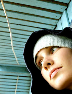
I like you're second design too, but I think the image looks a bit bitty and harsh around the edges. Maybe try blurring the edges a little bit to smooth it off. Also, I'm going to make the same comment I made on Andrew's about the angle of where the image is looking disrupts the flow of the design.
I'd suggest putting the image of Ed Jones above the text so his eyeline rests on your text, thus restoring a more natural flow of design.
Although I agree with Craig in some respects about you picking up on the jazz style, I think maybe your fonts could be a bit more jazzy.
I do like the contrast on your Ed Jones piece with the boldened text which makes the Wakefield Jazz and his surname stand out.
I think you've chosen some good pictures for the right shape banner too which is a difficult task in it's self so well done.
Hi
Look's good on the banners with them being blue. I was going to do mine a jazy blue colout but i figured the size would be over 20k so i stuck with black and white. On another point the writing on 2. looks abit blury.
Comment deadline.
Post a Comment